A great logo is key to standing out from your competitors and establishing credibility. We had the pleasure of working with Plastic Printers Inc recently to discuss updating their look as a part of their website re-design and inbound marketing retainer. I was so impressed with our teams process of delivering a new logo and updated website start to finish in 4 months.
When the time came to select a client for the Q4 HubSpot Impact Award in the category of Graphic Design, there was no doubt it had to be Plastic Printers.
Plastic Printers has an amazing story. Founder Luke Lingle first began printing plastic business cards nearly two decades ago in his parents' basement. Today the company has 60 employees and almost limitless capabilities for printing on plastic. From business cards, to plastic menus, custom indoor signs and luggage tags, they can do it all.
We started working last summer with Plastic Printers on a HubSpot COS website design. As part of their website redesign, they wanted to update their branding and logo so it had a more modern feel.
The Challenge of Updating a Business Logo
There was a lot of history behind the old Plastic Printers' logo. Like many companies, they had tweaked their logo and branding every couple years for nearly two decades.

One of our main goals for creating a new brand was to keep Plastic Printers' history and culture in mind. We started the project by interviewing key individuals at Plastic Printers to learn what they liked and didn't like about their current brand. From this stage we were able to pull the key elements and phrases that has brought Plastic Printers to where they are today. When updating a brand with such an established history, it's critical to conduct interviews to hear how leaders think about the brand in their own words.
I really was motivated by how at Plastic Printers, if you dream it, they will build it— that there are no limits with what they’re willing to do for their clients.
— Andrew Baumgartner, Art Director at Media Junction
As we dove into Plastic Printers' history, we were fascinated by the double circles, one of their key design elements that had shown up throughout the years. We felt the double circles represented the passion and energy that they have for their clients, in addition to their own company culture.
Listen to Media Junction's Andrew Baumgartner and Ryan VonBergen talk about the Plastic Printers' logo design process.
Once we had the icon, we paired it with a more modern typeface to give the Plastic Printers brand a more appealing presence. To finalize the brand, we also developed a brighter, more inviting color palette.
Here's the new logo design Media Junction created for Plastic Printers:

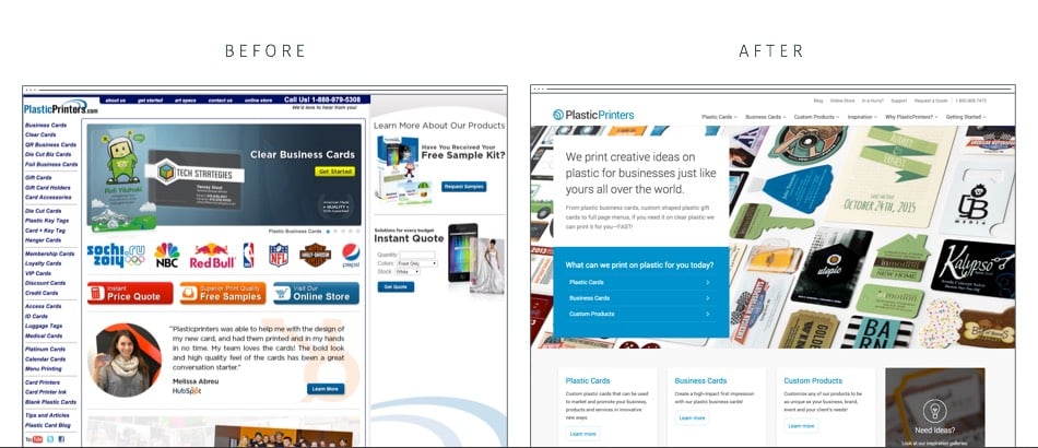
With the rebrand, we were able to completely change the feel of the Plastic Printers website to have a higher-end, more cohesive feel. Visitors are now able to be inspired with examples of Plastic Printers works and easily connect with a design consultant.
Here's the Before and After of the Plastic Printers website redesign:

Visit the new Plastic Printers website.


