Bayshore Networks is the cyber protection leader for the Industrial Internet of Things. Their proven cyber protection platform and technologies defend against cyber threats for industrial plants, equipment, and people.
Branding and Website Redesign Goals and Objectives
Bayshore Networks came to Media Junction knowing their main objective was a website overhaul. They already used HubSpot for marketing automation prior to being introduced to our team, but quickly gravitated towards having all areas of their digital efforts under one roof. They could build the website on the COS, have the marketing automation tool up and running for their marketing efforts, funnel leads through HubSpot forms and workflows, and manage customer contact info through the CRM.
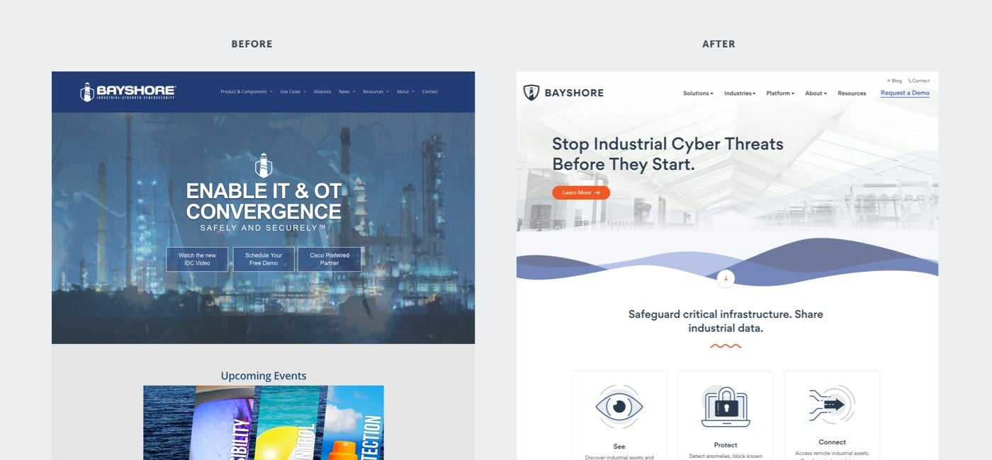
Kirby Wadsworth, Bayshore’s Chief Marketing Officer explains, “We knew the website was an absolute mess before we redesigned on the COS with Media Junction—it was built over a span of many years with a lot of different people involved, and a lot of ad-hoc updates over time. It was more of a bulletin board than marketing tool. There was no guidance for the user and no consideration for the modern buyer's journey.”
In tackling the website redesign, our team also felt that a brand refresh would play greatly into the success of their growth-driven initiatives. A well-designed brand identity could tell their company story and differentiate them in a new way from their competition. However, Bayshore Networks was attached to their brand—and resistant to making any significant changes.
We knew that we needed to break it down for them and prove the ROI in a branding refresh. Bayshore Networks needed a new color palette that would make them stand out from the crowd, but convey security technology with an industrial vibe. Logo design, typography, and iconography would need to showcase a modern and simple design aesthetic, while appealing to industrial tech audience.
“I started this process with a belief and an instruction that we didn't want to mess with the logo. We have a kind of iconic logo that revolves around a lighthouse. It goes with the name Bayshore, and we didn't want to mess with it. There was a lot of emotional attachment to it in the company.”
— Kirby Wadsworth, Bayshore Network's Chief Marketing Officer
Goal: Maintain Brand and Logo Consistency
Problem: The Logo Was Outdated, Unclear, and Not True to Their Company's Mission and Messaging
Throughout our conversations with the Bayshore team and researching the business, we knew we wanted to make the brand simple, but approachable. Heavy text and overbearing messaging caused friction in their users’ journeys. It was difficult to construe what services Bayshore Networks provides their customers, and the relation of the logo to the company’s values was lost on website visitors.
Solution: Carry over Major Components of Their Logo in a Modernized Way and Make Content More Digestible
Updating the logo with a minimalistic approach and bringing in white space were our first objectives. Users were able to navigate the website easily, find the content they were looking for, and eventually convert to a sales opportunity.
The elements of the Bayshore Networks logo, a shield and lighthouse, had significant meaning and stood for the values of the company. Media Junction suggested more focus on the shield—emphasizing the company’s key mission to protect clients from cyber threats. The lighthouse, which was the main focal point of the company’s old logo, obstructed the view of this shield. While the lighthouse symbolized visibility, another key characteristic of the company’s product (their platform discovers and detects threats to cyber security), our team felt the shield should be more prominent highlighting their “protective” identity.

Media Junction’s contemporary interpretation of Bayshore Network’s logo, a simplified combination of these elements, introduced a new idea of control. Bayshore’s Industrial Cyber Protection Platform gives customers exactly that—controlled access to enable safe and secure connection to the Industrial Internet.
Goal: Incorporate Brighter More Modern Feeling Elements That Resonate with the Right Target Market, but Stand out from Competitors
Problem: Bayshore Networks Was Attached to the Nautical Aesthetic and Had Brought in a lot of Dark Imagery and Coloring to the Old Website
Like many industry competitors, shades of navy blue, black, and gray saturated the old Bayshore Networks website. Companies in this space commonly sway towards dark metallics, somber hues, utilize similar stock photography and imagery, and share an overall theme.
Solution: Update Color Palette, Bring in Use of Customized Iconography, Maintain Nautical Aesthetic, and Set Bayshore Networks Apart from the Crowd

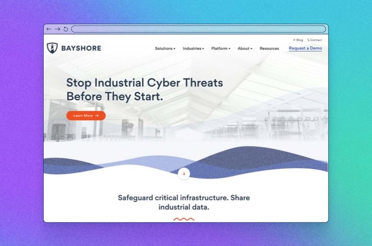
Media Junction helped Bayshore Networks refocus their brand by selecting a primary base color. The base color was then expanded into a complete palette which emote feelings of strength, trustworthiness, but also approachability. To contrast the base color pallette, an orange was selected to accent and call attention to CTA buttons, weigh points, and directional indicators.
Website visitors are guided to take action, resulting in an increase in customer contacts of 264%!
Media Junction took inspiration and utilized customized iconography as a point of departure from using stock photography that was commonly used amongst competitors in their business vertical. Elements such as wave-like lines were also brought into the design to maintain the the company’s nautical appearance.
“When we go to a trade show and all of our competitors around us are dark—black, gold, forest green, etc., we really stand out in the crowd. People come over because we're bright and light and they want to know what we do. It has had a really big impact on our business in unexpected ways.”
— Kirby Wadsworth, Bayshore Network's Chief Marketing Officer
The Results
Media Junction's vision and direction with Bayshore Networks brand and logo refresh enhanced existing brand elements to make the company distinct and stand out in a very crowded industry space.
The entire rebranding and growth-driven redesign has generated an increase in website traffic—up 22.65%! Website visitors and customers are interacting with the new designs positively with some landing pages converting up to 42%!
Customers are noticing the branding enhancements everyday. Wadsworth added, “We realized we were slowing down the learning process for our customers. Our new look makes customers want to interact with us and give us their information to start a conversation. We’re seeing a significant impact on the business and sales reps are coming to me and telling me that they can’t take on any more leads from the website! It’s a great problem to have.”


