HubSpot's reporting tools are a game-changer. They are not only user-friendly, but quite robust, making analysis a breeze. Plus, with the convenience of having all your data stored in one place, you can trust that everything you need is right at your fingertips.
In this post, we'll go through the different reporting options available in HubSpot and how to get started with HubSpot reporting.
What is HubSpot Reporting?
HubSpot reporting refers to the features in the HubSpot CRM that allows you to easily track and analyze their sales, marketing, and customer service activities. These tools provide you with valuable insights and data on a multitude of metrics, including website traffic, lead generation, sales performance, customer engagement, and more.
With HubSpot reporting, you have the ability to create personalized reports and dashboards, visualize data through eye-catching charts and graphs, and gain a comprehensive understanding of your business performance. This valuable tool can empowers you to make well-informed, data-driven decisions, identify emerging trends, measure the effectiveness of your strategies, and optimize your overall business performance.
What Types of Reporting Does HubSpot Offer?
HubSpot offers a wide range of reporting options that cater to various needs and purposes. These reports are designed to provide you with valuable insights and data to make informed decisions and optimize your business performance.
Single Object Reporting
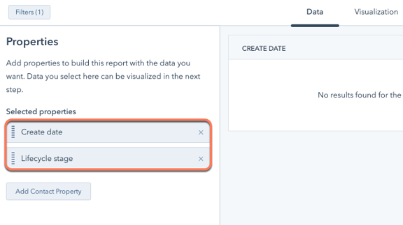
Another type of report offered by HubSpot is the single object report. This type of report focuses on analyzing one specific type of data, such as Contacts or Companies. Single object reports provide a detailed analysis of a particular aspect of a your business, allowing you to dive deep into the metrics and performance of that specific area. For example, a single object report on Contacts can provide insights into lead generation, conversion rates, or customer engagement.
Custom Reporting
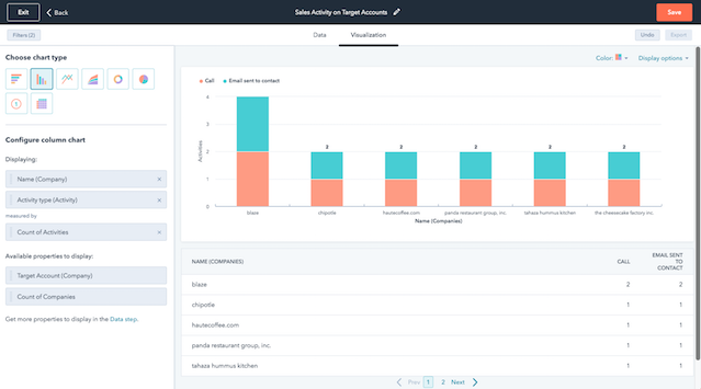
With HubSpot's custom report builder, you can analyze multiple data sources across HubSpot.The difference between the custom report builder and other types of HubSpot reports is that you can surface data from marketing and sales activities in addition to objects. For example, you can create a report to measure how your target accounts are engaging with your website.
Customer Journey Reporting
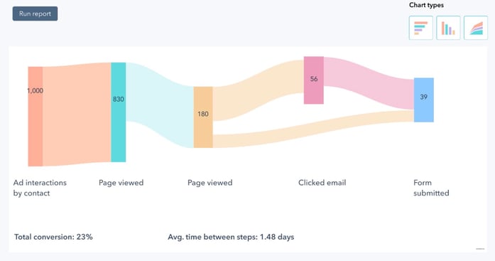
Additionally, HubSpot offers customer journey reports. These reports track and analyze the entire customer journey, from initial contact to conversion and beyond. Customer journey reports provide a holistic view of the customer's interactions with the business, allowing users to identify patterns, trends, and areas for improvement. By understanding the customer journey, businesses can optimize their strategies and provide a seamless experience for their customers.
Attribution Reports
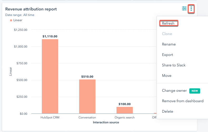
Attribution reports in HubSpot provide valuable insights into the effectiveness of your marketing efforts. These reports allow you to track and analyze the sources and channels that are driving traffic, leads, and conversions to your website. With attribution reports, you can determine which marketing campaigns, channels, or touchpoints are most influential in driving customer engagement and revenue.
This information can help you optimize your marketing strategies and allocate resources effectively. Attribution reports are particularly useful when you want to understand the customer journey and the impact of different marketing efforts along the way. By utilizing these reports, you can make data-driven decisions and improve the overall performance of your marketing campaigns.
Funnel Reports
Funnels reports in HubSpot are a powerful tool that allows users to track and analyze the progression of leads through various stages of the sales process. These reports provide valuable insights into the effectiveness of marketing and sales efforts, helping businesses identify areas for improvement and optimize their strategies.
There are a couple different types of funnels reports in HubSpot: Contacts and Deals.
Contact Funnel Reports
Contact funnel reports in HubSpot provide valuable insights into the customer journey. These reports track the conversion rates at each stage of the buyer's journey, from initial awareness to final purchase. This is measured through a Contact's progression through your lifecycle stages.

Deal Funnel Reports
Deal stage funnels, on the other hand, focus on the progression of deals through different stages, providing visibility into the sales pipeline. By analyzing the progression of deals through different stages, businesses can gain visibility into their sales pipeline and identify potential bottlenecks.
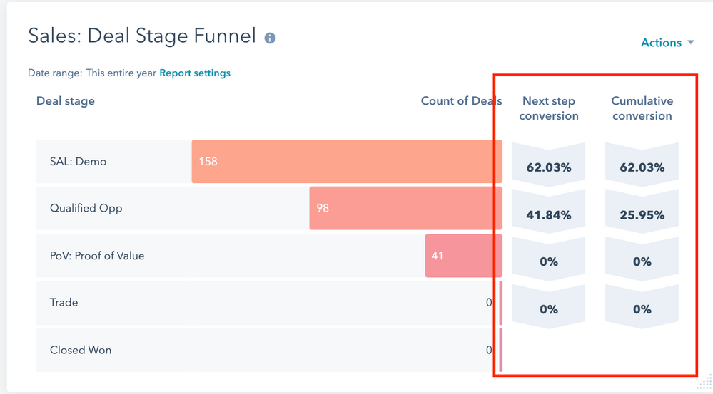 Funnels reports are particularly useful when businesses want to assess the efficiency of their sales and marketing processes, identify areas for improvement, and make data-driven decisions to drive growth and revenue.
How Do I Create a HubSpot Report?
To get started with creating a HubSpot custom report, you need to consider five things:
- Research question - what question(s) are you trying to answer by creating this report?
- Your data – this could include data about Contacts, Companies, Deals, activities, etc.
- Properties – these are the properties of the data you're reporting about
- Filters – filters allow you to specify what you'd like to report about. For example, you can filter contacts by their create date.
- Visualization – this is how you will display your data. For example, in an area graph, pie chart or table, among many other options.
In the following demonstration, we'll show the path to creating a custom report.
Choose a Research Question and Data for Your Report
In order to choose which data to use for your HubSpot report, consider what question you'd like to answer. Is it about the Contacts in your portal? The activities that your sales reps have taken? Narrowing your question down to the type--or types--of data is the first step to creating a report.
If you're having trouble coming up with a research question, HubSpot helps by offering some pre-made reports and questions at your fingertips. On the "Create reports" page, you can filter by data sources and scroll through sample reports.
Alternatively, you can click into the Custom Report Builder section. On the Data Sources tab, select one primary data source and check up to four more data sources. The Data join info on the right hand side will demonstrate the impact of the data you selected. The Primary data source will include all records of that type, whereas Secondary data sources will be data related to the Primary data.
Once you've selected your data source(s), simply click over to the "Sample Reports" tab. You can scroll through the options, or even search sample reports using keywords.
Alternatively, you can consider what question makes sense for your purpose. Review these examples:
- Research Question: How many marketing qualified leads do I have? And how am I getting them?
- Data: Contacts
- Research Question: What web pages are my recent live chats coming from?
- Data: Conversations
- Research Question: Of my Closed Deals, did the number of associated contacts on the Deal have a positive or negative impact on revenue?
- Data: Deals and Contacts
Choose the Properties for Your Report
Each object (Contacts, Companies, Deals, Tickets) or data source (conversations, activities, etc.) in HubSpot has what are called properties. These properties are fields that house the data about that information source.
For example, Contacts have properties like First Name, Last Name, email, and create date. Deals have properties like Amount and Close Date. You're also able to create custom properties for each object to store company-specific information.
When reporting, you will use these properties to define your axes and eventually find the answer to your research question.
In order to apply properties to your report, simply search or find them on the left hand side bar. Then, drag them into a field in the Configure tab.
Properties can be set as one of two types, which reflect whether an aggregation is performed on the data. This plays into property types in HubSpot and determines which axis you can place the data into.
- Dimensions go on the X-axis: fields with no aggregation, displayed as gray. Dimensions can be any data type, including dates, numbers, booleans, and strings. This type of field can ONLY be added to the X-axis and Break down by slot.
- Measures go on the Y-axis: fields with a set aggregation method, displayed as green. Measures are typically numerical or quantitative values, such as the number of associated Deals. This type of field can ONLY be added to the Y-axis.
Filter Your Report
Filters allow you to refine and focus your data analysis. With filters, you can specify what you want to report on, enabling them to answer specific research questions and gain deeper insights into their business performance.
For example, filters can be applied to Contacts based on their creation date, allowing you to track the growth and engagement of their audience over time. Filters can also be used to analyze data from specific channels or campaigns, providing valuable insights into the effectiveness of marketing strategies.
By using filters effectively, you can narrow down your data analysis and uncover meaningful patterns and trends that can inform your decision-making process.
To add a filter to a report, toggle from the Configure tab to the Filters tab. Properties that you have added to the Configure tab will appear in the Filters tab as Inactive filters. More than likely, you'll filter using the properties you've already included in your report.
You can also drag new properties over from the data area to utilize. In order to make your filter active, click on the Inactive filter and select your parameters.
Filter logic will vary based on the type of property you're filtering with. For example, common filters for a data property include "is after" and "is before."
As you progress, you can also use custom filter rules to further hone in on the data you want to see.
Choose a Chart Type to Visualize Your Data
When it comes to custom reporting in HubSpot, there are various chart types available to help users visualize and analyze their data effectively. Each chart has specific superpowers to help you analyze a type of data.
Bar Chart
One of the chart types is the bar chart, which is commonly used to compare different categories or groups. It is useful when you want to understand the distribution or comparison of data across different segments. This is one chart that you can use the "break down by" feature to segment the bars by a tertiary metric.
Line Graph
Line charts are particularly useful when you want to track trends over time or visualize the progression of a specific metric. For example, if you want to analyze the growth of your website traffic over a period of months or years, a line chart would be an appropriate choice. It allows you to easily identify any patterns, spikes, or dips in their data and make informed decisions based on these insights.
Scatter Plot
Select a scatter plot when you want to analyze the relationship between two variables. This chart type is ideal for visualizing the correlation and distribution of data points. A scatter plot displays individual data points as dots on a graph, with one variable represented on the x-axis and the other variable on the y-axis.
The unique feature of a scatter plot is that it allows you to identify any patterns or trends in the data, such as clusters or outliers. By analyzing the position of each data point on the graph, you can gain valuable insights into the relationship between the variables and make informed decisions based on these findings.
Area Graph
Similar to the line graph, and area graph is particularly useful when you want to track trends over time or visualize the progression of a specific metric. It allows you to easily identify any patterns, spikes, or dips in their data and make informed decisions based on these insights.
The unique feature of an area graph is that it displays the data as a series of connected data points, with the area between the line and the x-axis filled in. This makes it visually appealing and helps users understand the overall trend of the data. The area graph is a great choice when you want to showcase the growth or decline of a particular aspect of their business over time.
Pie or Donut
The pie or donut chart is a unique and eye-catching way to represent data and can provide valuable insights into different categories or groups. These charts are especially effective when you want to compare the distribution or proportion of data across different segments. With its circular shape, the donut or pie chart allows users to easily see the relative sizes of each segment and identify any patterns or trends.
KPI Chart
A KPI (Key Performance Indicator) chart is ideal for tracking and displaying key metrics and performance indicators. It provides a quick and concise overview of important data points, making it easier for users to monitor progress towards their goals.
By focusing on key metrics, you can quickly identify trends, patterns, and areas of improvement. Whether you're tracking the number of marketing qualified leads, analyzing the impact of associated contacts on revenue, or monitoring the source of live chats on your web pages, a KPI chart can provide valuable insights to inform your decision-making process.
Combination
The combination chart is particularly useful when you want to compare and analyze multiple metrics or variables at the same time. This chart allows you to display different types of data, such as numerical values and trends, in a single view.
The unique feature of the combination chart is its ability to combine different chart types, bar charts and line graphs, into one comprehensive visual representation. This enables you to gain a holistic understanding of their data and easily identify any patterns or correlations between different variables.
Whether users want to analyze the distribution of data across different segments, track trends over time, or explore the relationship between two variables, the combination chart in HubSpot reporting offers a powerful and flexible tool for data analysis and visualization.
Table
Selecting a table is a great option when you want to present your data in a structured and organized format. A table chart allows you to display your data in rows and columns, making it easy to compare and analyze different variables. Unlike other chart types, a table provides a comprehensive view of your data, allowing you to include multiple dimensions and measures in a single view.
Additionally, tables offer advanced functionalities such as sorting and filtering, which further enhance the usability and flexibility of the chart.
Pivot Table
A pivot table allows you to summarize and manipulate your data by aggregating it based on different dimensions and measures. This is particularly useful when you want to analyze the relationship between multiple variables or compare data across different segments.
For example, if you want to understand how the number of associated Contacts on closed Deals impacts revenue, a pivot table can provide valuable insights by summarizing the data based on these dimensions.
In contrast, a regular table is a great option when you simply want to present your data in a structured format without any manipulations or aggregations. It allows you to display your data in rows and columns, making it easy to compare and analyze different variables.
Gauge
The gauge chart is designed to provide a quick and concise overview of a specific metric or key performance indicator (KPI). It allows you to showcase a single value in relation to a predetermined target or goal. This chart type is especially effective when you want to track progress towards a specific objective or highlight areas that need improvement. The gauge chart provides a clear and intuitive visual representation that can easily be understood at a glance, making it a valuable tool for data analysis and decision-making.
Add Your HubSpot Reports to Dashboards
Once you've created some reports to answer your research questions, you can add a selection of your reports to a HubSpot dashboard. This allows you to review them along with other reports answering similar questions. By incorporating these reports into your dashboards, you can easily monitor and track key metrics and performance indicators.
To add a report to a dashboard, you have a couple options:
1. Add to Dashboard after creation
After creating a report, this pop up will appear, prompting you to name the report. You can also select a dashboard to add it to at this time.

2. From the My Reports area
In the My Reports area, hover over the report and click the Actions drop down. Add to dashboard via the option in the list.

3. From another Dashboard
You can even add a report to a dashboard from another dashboard, should you want it to exist in multiple places.

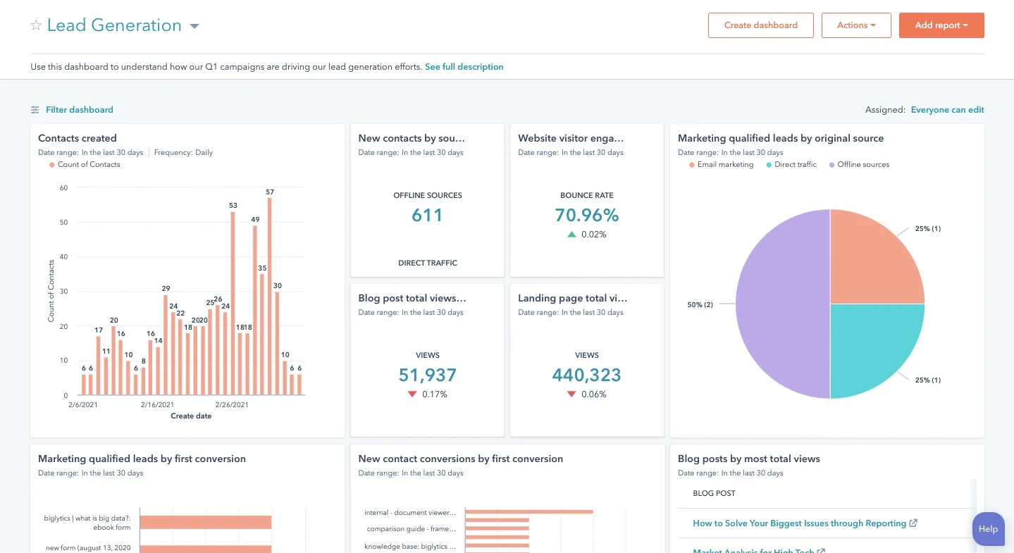
Organizing the reports on the dashboard should be done strategically to ensure a clear and concise presentation of the data. One approach is to group related reports together, such as placing reports related to marketing performance in one section and reports related to sales performance in another.
Another approach is to arrange the reports in a logical order, starting with the most important or high-level metrics at the top and then progressively drilling down into more detailed reports.
Whichever organization method you choose, the goal is to create a visually appealing and informative dashboard that provides valuable insights into your business performance.
Conclusion
HubSpot offers a diverse range of reporting options that cater to different needs and purposes. Whether it's a custom report analyzing multiple data sources, a single object report focusing on one specific area, or a customer journey report tracking the entire customer experience, HubSpot's reporting tools empower you to make data-driven decisions, measure performance, and optimize their business strategies.
By learning how to choose and utilize each type of report, you can unlock the full potential of HubSpot's reporting tools. With a deep understanding of the available options, you can tailor their reports to answer specific questions and address their unique business needs
Written by:
Media JunctionRelated Topics:


